Company
Pagos Introduces New Features for Advanced Payments Data Visualization
November 1, 2024
November 1, 2024

Grace Greenwood
Grace Greenwood

The Pagos team is ever-focused on making it easy to dig into your payments data in pursuit of insights and opportunities. Whether you know exactly what key performance indicators (KPIs) you want to analyze or are simply monitoring valuable customer segments in search of optimization potential, Pagos has you covered! With this in mind, we're excited to announce two new features in our payments data aggregation and visualization platform: Focus and Charts.
Digging Into Details Quickly
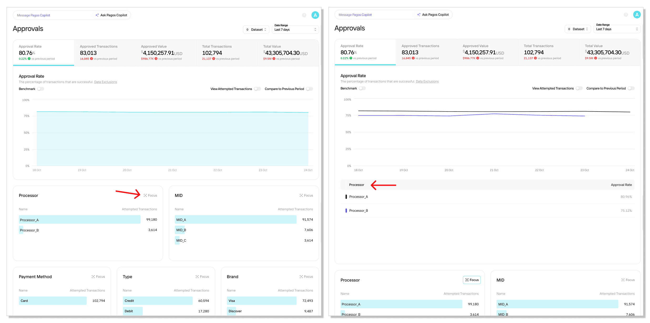
The first new development is a feature in the Metrics pages called Focus. Focus is all about granting you quick and easy access to multi-dimensional breakdowns of your payments metrics. On most bar lists in your Metrics pages, you’ll now find a Focus icon in the top right:

A single click shifts the main graph on the page to highlight data based on your selected bar list. For example, say you’re reviewing the Approval Rate tab within the Approvals Metrics page. You see that your transaction volume is split very unevenly between the two payment processors you currently use. To better understand how approval rate may also differ between these processors, you can simply click Focus on the Processors bar list. Suddenly the main graph now shows your approval rate over time for each processor side by side. With a single click, you now have a clear view at a glance!
Check out the video below for a complete walkthrough of this new feature:
Build Custom Charts on the Fly
The Pagos team knows data—especially payments data. As such, we've built our data visualization tool to by default display historically important payment metrics broken down by common dimensions like processor, payment method, and issuing country. The Metrics pages are a testament to that! But sometimes you want to perform your own organic payments data analysis, honing in on the KPIs or customer segments exactly the way you need them. That's why we've created Charts!
The new Charts section of Peacock lets you build fully customizable data visualizations. You can track any payment metric, segment data by the dimensions that matter most, and choose the chart style that suits your business. With this flexibility, you can create the exact visuals you need for a deeper analysis or when reporting changes back to leadership. Check out the demo below to see how this feature works and explore how Charts can transform the way you interact with your payments data!
What Are You Waiting For?
If you’re interested in seeing your payments data in this level of detail, you need Pagos. Our platform has everything you need to turn go from simple payments processing to true payments optimization. Reach out today to request a demo!
This post was authored by Trent Woodbury, Joacim Strand, Vanja Smailovic on the Pagos Machine Learning, Analytics, and Data Engineering team.
The Pagos team is ever-focused on making it easy to dig into your payments data in pursuit of insights and opportunities. Whether you know exactly what key performance indicators (KPIs) you want to analyze or are simply monitoring valuable customer segments in search of optimization potential, Pagos has you covered! With this in mind, we're excited to announce two new features in our payments data aggregation and visualization platform: Focus and Charts.
Digging Into Details Quickly
The first new development is a feature in the Metrics pages called Focus. Focus is all about granting you quick and easy access to multi-dimensional breakdowns of your payments metrics. On most bar lists in your Metrics pages, you’ll now find a Focus icon in the top right:

A single click shifts the main graph on the page to highlight data based on your selected bar list. For example, say you’re reviewing the Approval Rate tab within the Approvals Metrics page. You see that your transaction volume is split very unevenly between the two payment processors you currently use. To better understand how approval rate may also differ between these processors, you can simply click Focus on the Processors bar list. Suddenly the main graph now shows your approval rate over time for each processor side by side. With a single click, you now have a clear view at a glance!
Check out the video below for a complete walkthrough of this new feature:
Build Custom Charts on the Fly
The Pagos team knows data—especially payments data. As such, we've built our data visualization tool to by default display historically important payment metrics broken down by common dimensions like processor, payment method, and issuing country. The Metrics pages are a testament to that! But sometimes you want to perform your own organic payments data analysis, honing in on the KPIs or customer segments exactly the way you need them. That's why we've created Charts!
The new Charts section of Peacock lets you build fully customizable data visualizations. You can track any payment metric, segment data by the dimensions that matter most, and choose the chart style that suits your business. With this flexibility, you can create the exact visuals you need for a deeper analysis or when reporting changes back to leadership. Check out the demo below to see how this feature works and explore how Charts can transform the way you interact with your payments data!
What Are You Waiting For?
If you’re interested in seeing your payments data in this level of detail, you need Pagos. Our platform has everything you need to turn go from simple payments processing to true payments optimization. Reach out today to request a demo!
This post was authored by Trent Woodbury, Joacim Strand, Vanja Smailovic on the Pagos Machine Learning, Analytics, and Data Engineering team.
Share this Blog Post
Share this Blog Post
Let's Chat on
Want to dig deeper into payments data, news, and insights? Have hot takes of your own?
We're talking all things payments on Reddit.
Latest Blog Posts
Subscribe to our Blog
Subscribe to
our Blog
Subscribe to our Blog
By submitting, you are providing your consent for future communication in accordance with the Pagos Privacy Policy.
Let's Chat on
Let's Chat on
Want to dig deeper into payments data, news, and insights? Have hot takes of your own?
We're talking all things payments on Reddit.


