

Products
Introducing Collections: Your Organized, Personalized Dashboard for Payment Insights


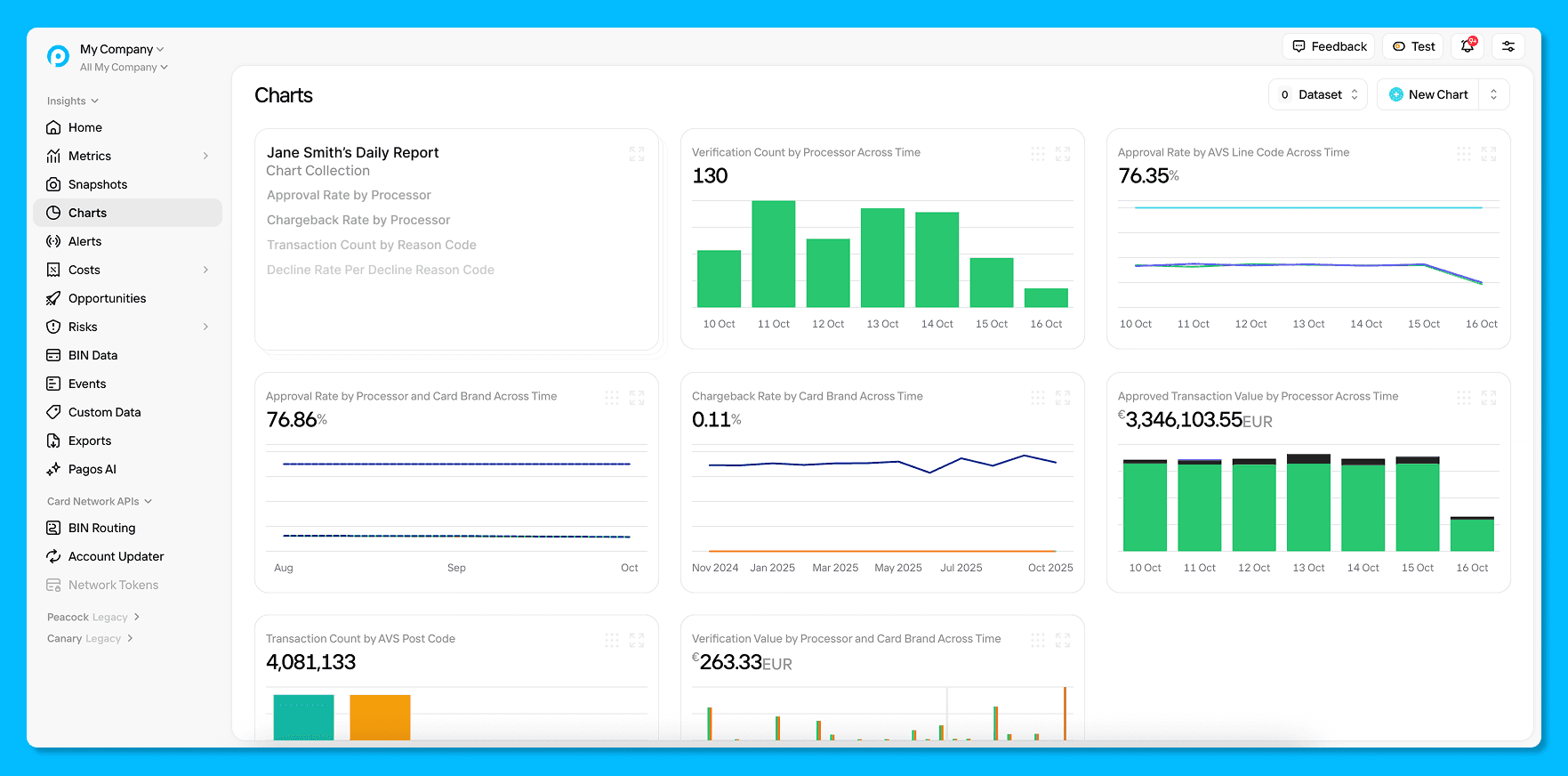
You open the Charts section of Pagos Insights and there they are: dozens of graphs, snapshots, and comparisons you’ve customized just for you and your business. Each one uses payments data to tell a story about your payments operations, but after a while, it’s hard to remember which chart shows what, or why you built it in the first place.
As more teams have started taking advantage of Charts, something interesting has happened: what started as a simple analytics space has become the go-to hub for every insight, question, and test. That success comes with a familiar side effect: clutter.
You brought it up, and we listened. We’re excited to announce the upcoming launch of Collections, a place for organizing your own custom data visualizations into neat and tidy dashboards. It’s time to bring back the clarity, focus, and personalization you need to make sense of payments data.
From Dashboard Clutter to Curated Focus
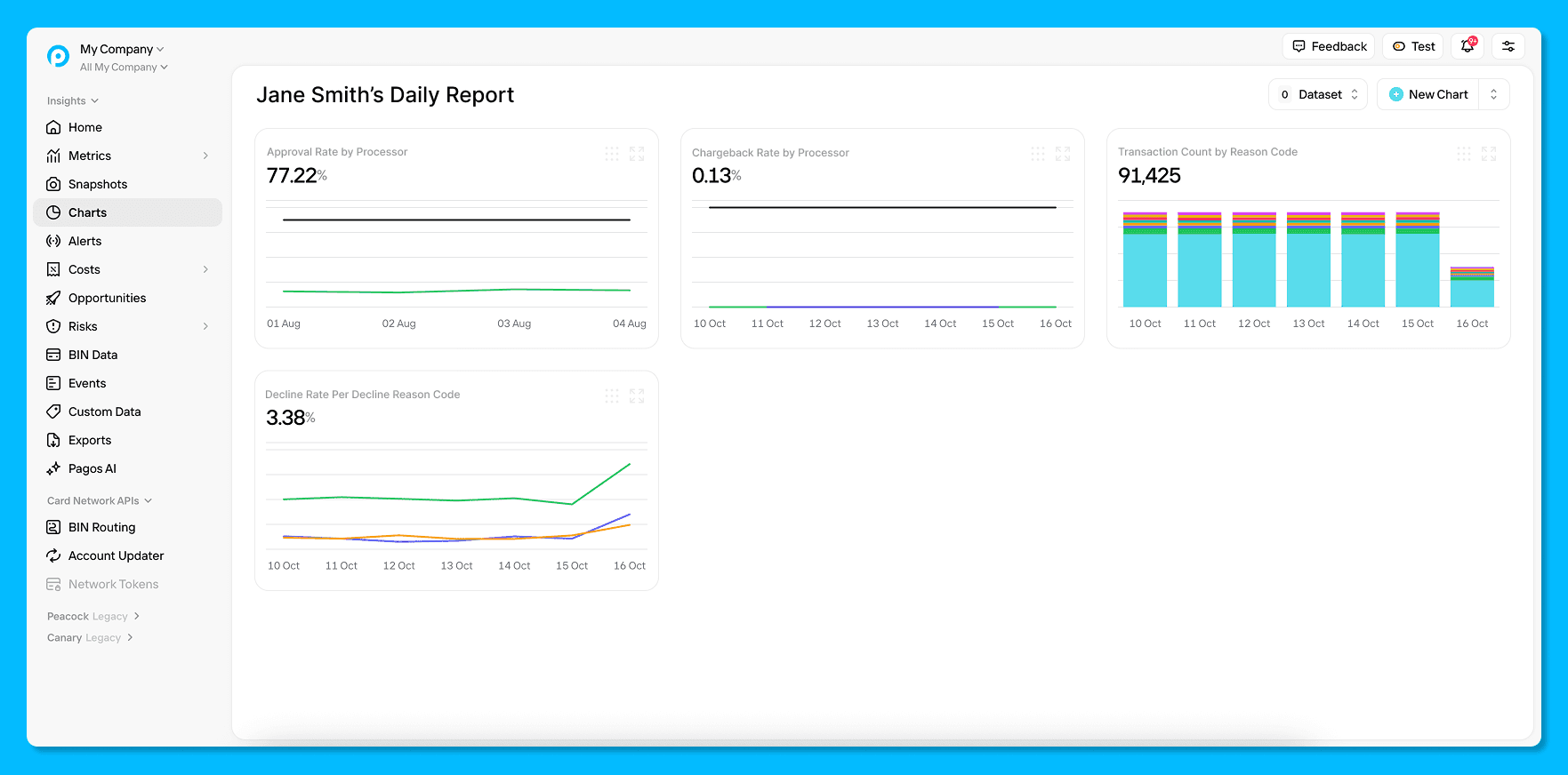
Collections give you a flexible way to organize, name, and preserve the custom charts that matter most. Think of them as your personal workspace, a place to group related charts and keep your analysis neatly structured. Walk away and come back to find your data exactly as you left it. This is especially important if you’ve developed a process for monitoring the same data visualizations at regular intervals—now you know exactly where to go each time without fear of someone else accidentally making unwanted changes.
You can drag and drop charts into Collections, and easily create your own space for your data. Rename charts and descriptions to capture why you created them. No more rebuilding the same chart twice. No more wondering which one had the right filters. Just clean, organized insights that work the way you do.
Built from Real Feedback
Collections were inspired by feedback from customers who rely on Charts every day to understand their payments data. As usage grew, so did the need for a more personal way to stay organized: a space where each chart can have context and meaning. It’s not just about reducing clutter; it’s about turning your data into a dashboard that works the way you do.
A Smarter Way to Work with Data
Collections are rolling out next week, and we can’t wait for you to try them. Start organizing your go-to charts, add the context that matters most, and discover how much faster insights appear when everything just makes sense. Spot payments optimization opportunities sooner and act with confidence—all with Pagos Insights.
Learn more about Pagos Insights on our website and contact our Sales team for a demo today!

By submitting, you are providing your consent for future communication in accordance with the Pagos Privacy Policy.