Peacock
Using Custom Dashboards to Compare Data Segments

In Peacock by Pagos, there are two types of dashboards: standard and custom. Standard dashboards contain pre-made collections of data visualizations delineating key metrics across the payment transaction lifecycle, from verifications through authorization, and even to post-settlement metrics like chargebacks.
Custom dashboards, on the other hand, are yours to use however you want. Using our simple drag-and-drop design, you can build a brand new dashboard of your choosing containing any of the charts available in Peacock. Add any combination of charts, name your dashboard, and save it for future use.
Among Pagos customers, we see two primary use cases for custom dashboards:
Looking at different metrics across one population
Looking at the same metric across different populations
In this blog post, we’ll explore the value of each of these custom visualization use cases, and then outline the features of Peacock that make them possible. Let’s fly in!
The Value of Evaluating Different Metrics Across One Population
If you want to analyze payment data for one of your payment vendors or one of your customer segments holistically, custom dashboards are the right fit for you. Let’s say your MIDs are in line with your different business segments, meaning you process transactions for each segment through separate, unique merchant accounts. If you funnel all US online business through a single MID, for example, you could then monitor the performance of that business segment in a single custom dashboard filtered to only show transactions for that MID. Here’s how that custom dashboard could look:
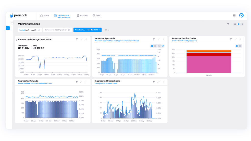
First, notice the entire custom dashboard is filtered using the Merchant Account ID option within the Processor filter; this is how we ensure we’re only evaluating the data for transactions processed through the MID in question. The charts selected in this dashboard example allow you to evaluate the overall health of the associated business segment, including turnover and average order value (AOV), processor approvals, declines, and wrapping up with refunds and chargebacks. If you are also responsible for managing costs, you may include a chart demonstrating cost categories.
Why is this valuable? You’ve essentially made a scorecard for one segment of your business. You could replicate this process for each MID or business segment. That way, you have a quick place where you can enter Peacock and see a holistic view of performance every day!
The Value of Evaluating the Same Metric Across Different Populations
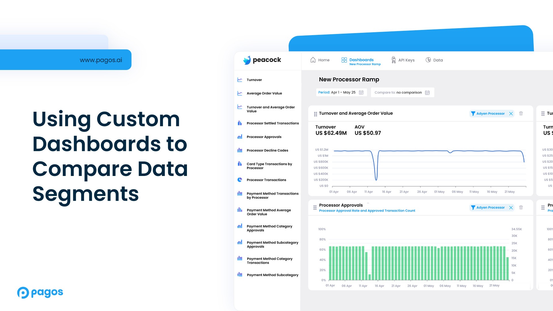
The other primary use case for custom dashboards is looking at the same metric across different populations. This is particularly helpful when you want to perform a comparative analysis. Let's consider a situation in which you’re ramping up a new processor. In this scenario, you’ll want to compare performance—namely, approval rates—over time for the two processors side-by-side. To confirm your new processor is ramping up as expected and provide some context for the approval rates, you want to compare total transaction volume for your two processors, as well.
As such, your custom dashboard might look something like this:
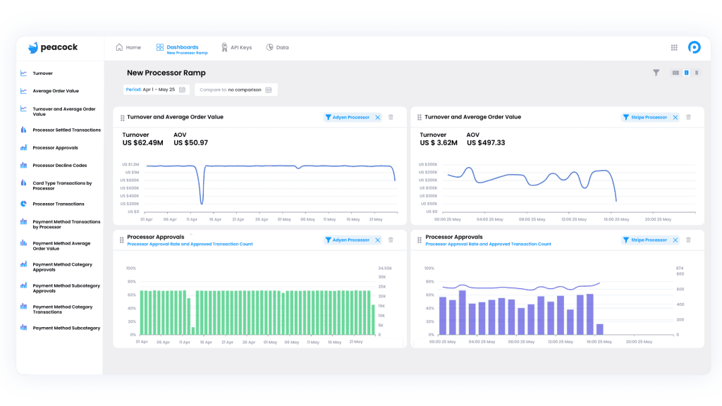
In this example, you’ve created a command center for yourself to monitor the progress of the difficult task of onboarding a new processor. And because Peacock custom dashboards are fully customizable, you can add more charts to this command center as your needs change. If you’re worried the new processor is suddenly throwing technical declines, you could simply add a third row to the dashboard comparing decline code details.
Every day, you could log into Peacock, review this singular dashboard you’ve created for yourself, and have informed conversations and checkins about the progress of this work. Not to mention the fact that you’ll be able to easily identify any problems, should they arise.
In this scenario, we’ve applied Views to each chart to ensure the left three only show data for one processor, while the right three show data for the other processor. We’ll get into the details of applying Views in the section below.
Ultimately, segmentation of your transaction data is the key to both types of custom dashboards. Let’s take a look at a few ways Pagos lets you segment your data.
How To Achieve Data Segmentation
You can segment data in Peacock using our built-in collection of filters. For a baseline explanation of which filters are available and what they mean, see our Data Filters guide. Let’s expand on some of these segmentation filters and what they can do for you.
Metadata and Soft Descriptors
Metadata and soft descriptors are both custom fields you can attach to any transaction through your processor. Truly, you can add fields to your transactions and label them any way that you want; there are no restrictions to the metadata and soft descriptor fields.
If you’re new to metadata and soft descriptors, here are a few common ways they’re used:
Enumerating retry attempts on a transaction
Identifying sub-merchants of a marketplace
Labeling vendors
Identifying sales channel
While the options are limitless, the metadata and soft descriptor fields are best used to filter for segments of data that are unique to your business. For example, you could create a custom dashboard containing six versions of the Aggregated Chargeback chart, each filtered to only show data for one of your top six sub-merchants by volume. This would alert you to the performance of these individual sub-merchants and also help you identify any fraudulent attempts among this population.
For a more in-depth explanation of metadata and soft descriptors see our Getting the Most Out of Your Data: Using Tags, Soft Descriptors, and Metadata blog post.
Tags
Tags relate specifically to the data sources connected to your Pagos account and define a custom hierarchy specific to the Pagos ecosystem. By adding tags to your data sources within Pagos, you can then filter dashboards and charts to only show data for transactions imported from each data source. To learn more about tags, see the Data Sources guide in our product documentation.
Commonly, tags are used to assign logic to market or business segments. In the context of custom dashboards, tags are a great way to create a scorecard for a particular market or business segment, or to compare how two markets or business segments are performing against each other.
Views
Views, at their simplest level, are the combination of multiple filters in Peacock. For example, if you wanted to regularly check in on processor 1’s performance when processing transactions made with payment cards from card brand 1 in a certain currency, simply apply all three filters (Processor, Card Brand, and Currency), and then save the View. You can even name this new View however you want.
When you apply a View to a standard dashboard, it filters all the charts on your screen accordingly. In custom dashboards, however, you can apply different Views to different charts. This is great for the comparison use case described above.
Let’s say you just onboarded Braintree as a processor and you want to evaluate Braintree’s performance over the four major card brands: Visa, Mastercard, Amex, and Discover. You start by creating a View with the Processor filter set to Braintree and the Card Brand filter set to Visa and save it with the name “Braintree-Visa.” You repeat this for each card brand until you have 4 saved Views:
Braintree-Visa
Braintree-MasterCard
Braintree-Amex
Braintree-Discover
Then you could create a custom dashboard with four Approval Rate by Processor charts, each assigned one of the saved Views listed above. This would allow you to have a singular place where you can compare card brand performance across a single processor!
Keep in mind, Views are not limited to just two filters. You can add as many filter combinations as you’d like. This means that you can really dig into the minutiae of your data segments in whichever way you’d like.
The Mechanics of the Custom Dashboard
Custom dashboards are made up of the combination of any of the charts that are part of the standard dashboard chart libraries. When you enter the custom dashboard page, you can create a new dashboard by clicking the Add New Dashboard or the Create New buttons on the screen.
At that point, you can search any of the chart titles in the left side panel and drag and drop them into the chart spaces in the center of the screen. After you add a chart to the dashboard, you can add a View by clicking the funnel icon on the top right hand side of the chart. There, you will see a list of the names of all of your saved Views and can apply them accordingly.
When you’re ready, name your dashboard at the top and save. You can later access and edit all previously saved dashboards on the left side panel. For more information, see our Custom Dashboards guide.


By submitting, you are providing your consent for future communication in accordance with the Pagos Privacy Policy.