

Peacock
We've Added More Color to Peacock: Card Brand and Issuing Country Dashboards
March 1, 2023
March 1, 2023

Tomas Armellin
Tomas Armellin
Tomas Armellin

There are many different types of payment methods used across the world and we support more than 60 of them thus far, but in almost all countries, card payments hold the majority. So if you’re processing card payments, it’s essential for you to understand the differences between card brands and issuing countries. Each card brand presents its own set of rules, and the issuing country can impact transaction fees, currency exchange rates, and other factors—all of which can influence the cost and efficiency of payment processing. Familiarizing yourself with the unique characteristics of each card brand and the impact the issuing country can have on payments processing allows you to make informed decisions about where you can improve performance and how to protect your customers and business against fraud and other risks.
All of this complexity can be confusing and even frustrating. That’s why we’ve released two new dashboards in Peacock to give you clear and simple views of how card brands and issuing countries are impacting your business. And because we do the hard work of harmonizing all your data, you can rest assured that you’re comparing apples to apples. From there, you can filter your data as you need (e.g. a specific time period) and produce a set of data visualizations which allow you to identify areas for optimization and take meaningful action to grow and improve your business.
The Card Brand Dashboard
The beautiful feathers of the male peacock are called a train and can be up to 6 feet long. There are as many “colors” in card brands as there are in a peacock's train, and that is why it’s important to analyze their performance over time. In this way, you can identify trends and explore details by card brand that are directly linked with consumer preferences and behavior. We have specifically designed charts to help our customers achieve this.
Introducing: the Card Brand dashboard in the Peacock Service Panel.

Charts across all our dashboards are presented in a way which replicates the payment transaction sequence: from transaction data (count, value) to approval data (approval rates) to decline data (decline codes). The type of charts that we use aim to simplify the way we show your data: pie charts, bar charts, line charts, and tables. On each of these charts, you’ll find sub-charts that provide more information. For example, on the Card Brand Decline Codes chart you can choose to view the data on a stacked bar chart and filter by your preferred card brand; you can also choose to see your data in a table format to view top decline codes by card brand (both by count and value). Have a favorite view? Click on the star icon next to the sub-chart title, and you’ll set that sub-chart as your default.
Another useful chart we designed is the Top 25 BINs by Card Brand. It lists the top BINs of the transactions that you processed by card brand (both by the total number of transactions processed and their total transaction value), which can be particularly helpful in identifying card brand performance across different banks.
The Issuing Country Dashboard
Each country has its own legal requirements, rules, and regulations which impact card payments processing. This means that the issuing country influences how each transaction is managed: some might be approved or declined more easily, accepted payment methods might vary, and even the decline reasons could be different depending on the country that the issuing bank is located in. The Issuing Country dashboard plays a key role in understanding how different countries directly influence your payments performance so you can make changes that match the expectations of the cardholder or the issuing bank.

The Issuing Country by Processor chart expands on how processors behave differently according to the issuing country. You can check processor approved transactions by issuing country, both by count and value. Similarly, the Payment Method by Issuing Country chart helps you analyze the different payment methods used by the issuing country, by count and value. And don’t forget to use all the rest of Peacock’s features while viewing the charts: saving filter combinations as views, building custom dashboards, using the soft descriptor and metadata filters to deep dive on any specific component of your choice, and many more!
Ready To Do More?
The more accessible and understandable your data is, the more ways you can act on it to better your customer experience and your business. Click the button below to get started:
We’re excited about this new release of views and welcome your input on what else you’d like to see. Contact us to share your ideas or request a demo:
There are many different types of payment methods used across the world and we support more than 60 of them thus far, but in almost all countries, card payments hold the majority. So if you’re processing card payments, it’s essential for you to understand the differences between card brands and issuing countries. Each card brand presents its own set of rules, and the issuing country can impact transaction fees, currency exchange rates, and other factors—all of which can influence the cost and efficiency of payment processing. Familiarizing yourself with the unique characteristics of each card brand and the impact the issuing country can have on payments processing allows you to make informed decisions about where you can improve performance and how to protect your customers and business against fraud and other risks.
All of this complexity can be confusing and even frustrating. That’s why we’ve released two new dashboards in Peacock to give you clear and simple views of how card brands and issuing countries are impacting your business. And because we do the hard work of harmonizing all your data, you can rest assured that you’re comparing apples to apples. From there, you can filter your data as you need (e.g. a specific time period) and produce a set of data visualizations which allow you to identify areas for optimization and take meaningful action to grow and improve your business.
The Card Brand Dashboard
The beautiful feathers of the male peacock are called a train and can be up to 6 feet long. There are as many “colors” in card brands as there are in a peacock's train, and that is why it’s important to analyze their performance over time. In this way, you can identify trends and explore details by card brand that are directly linked with consumer preferences and behavior. We have specifically designed charts to help our customers achieve this.
Introducing: the Card Brand dashboard in the Peacock Service Panel.
Charts across all our dashboards are presented in a way which replicates the payment transaction sequence: from transaction data (count, value) to approval data (approval rates) to decline data (decline codes). The type of charts that we use aim to simplify the way we show your data: pie charts, bar charts, line charts, and tables. On each of these charts, you’ll find sub-charts that provide more information. For example, on the Card Brand Decline Codes chart you can choose to view the data on a stacked bar chart and filter by your preferred card brand; you can also choose to see your data in a table format to view top decline codes by card brand (both by count and value). Have a favorite view? Click on the star icon next to the sub-chart title, and you’ll set that sub-chart as your default.
Another useful chart we designed is the Top 25 BINs by Card Brand. It lists the top BINs of the transactions that you processed by card brand (both by the total number of transactions processed and their total transaction value), which can be particularly helpful in identifying card brand performance across different banks.
The Issuing Country Dashboard
Each country has its own legal requirements, rules, and regulations which impact card payments processing. This means that the issuing country influences how each transaction is managed: some might be approved or declined more easily, accepted payment methods might vary, and even the decline reasons could be different depending on the country that the issuing bank is located in. The Issuing Country dashboard plays a key role in understanding how different countries directly influence your payments performance so you can make changes that match the expectations of the cardholder or the issuing bank.
The Issuing Country by Processor chart expands on how processors behave differently according to the issuing country. You can check processor approved transactions by issuing country, both by count and value. Similarly, the Payment Method by Issuing Country chart helps you analyze the different payment methods used by the issuing country, by count and value. And don’t forget to use all the rest of Peacock’s features while viewing the charts: saving filter combinations as views, building custom dashboards, using the soft descriptor and metadata filters to deep dive on any specific component of your choice, and many more!
Ready To Do More?
The more accessible and understandable your data is, the more ways you can act on it to better your customer experience and your business. Click the button below to get started:
We’re excited about this new release of views and welcome your input on what else you’d like to see. Contact us to share your ideas or request a demo:
Share this Blog Post
Share this Blog Post
Latest Blog Posts
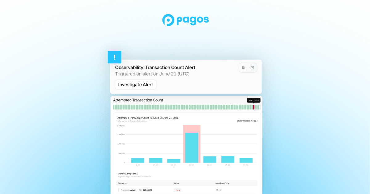
Catching Spikes Before They Burn You: Monitoring BINs to Stay Ahead of Carding Attacks
Catching Spikes Before They Burn You: Monitoring BINs to Stay Ahead of Carding Attacks
Catching Spikes Before They Burn You: Monitoring BINs to Stay Ahead of Carding Attacks

Boosting Pagos’ Engineering Capacity with AI
Boosting Pagos’ Engineering Capacity with AI
Boosting Pagos’ Engineering Capacity with AI
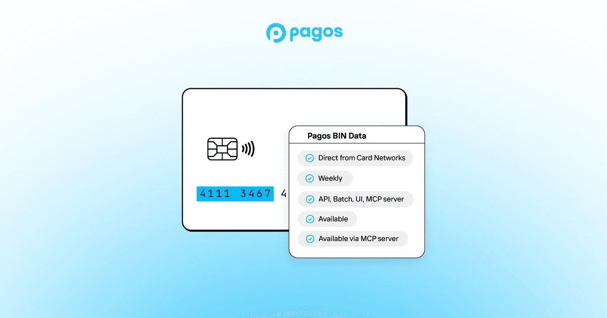
Pagos BIN Data: The Superior Choice for Smarter Payments
Pagos BIN Data: The Superior Choice for Smarter Payments
Pagos BIN Data: The Superior Choice for Smarter Payments
Subscribe to our Blog
Subscribe to
our Blog
Subscribe to our Blog
By submitting, you are providing your consent for future communication in accordance with the Pagos Privacy Policy.