

Peacock
A Peacock User Guide: Getting the Most Out of the Data Visualization Interface
October 24, 2021
October 24, 2021

Katie McCarthy
Katie McCarthy
Katie McCarthy
By now, you’ve seen the power of Peacock by Pagos. You understand how the application supports payment data aggregation, visualization, and performance investigation. Now, let’s spend some time learning how to navigate the application in order to harness its full potential.
Starting from the Top: Why High-Level Summaries Are Helpful
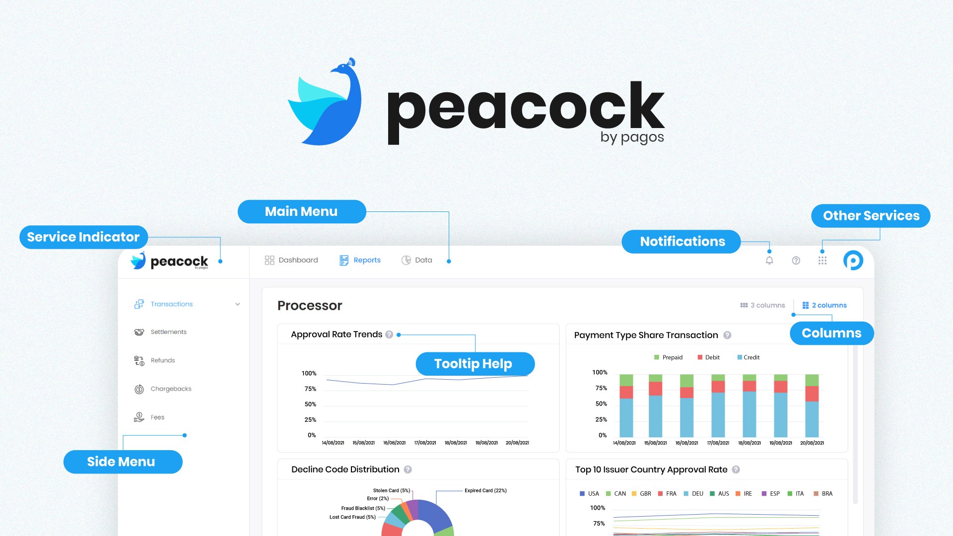
When you log into Peacock, you first land on the Dashboard. In the default configuration, you will find six metrics that Pagos knows to be the most critical information when it comes to a company’s payments “pulse check”. See below for more information about these metrics and why they matter.
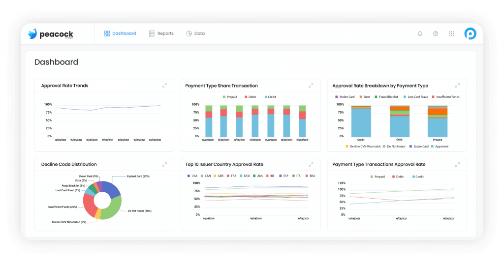
Turnover is the total successful sales transactions, minus refunds and chargebacks that settled on the same day. This is a point-in-time measurement of how much your net revenue is changing each day.
Average Order Value (AOV) is the average dollar amount your customers spend each time they place an order. AOV is a good proxy for how much revenue you can expect from each additional transaction.
Approval Rate Trends by Processor is the number of authorized transactions as a percentage of attempted transactions, separated by processor. High approval rate means more converted sales and fewer abandoned carts.
Transactions are the amount of all sales over time. Trends in your transaction volume help you understand your products’ seasonality, the traction of recent marketing campaigns, and overall customer engagement.
Chargebacks are the total dispute count for all processors by card network. This is a good lagging indicator for either (1) friendly fraud, or (2) issues with your product or customer operations.
Settled Volume by Processor is the total disbursed volume by day and by processor. This not only indicates what portion of your business is transacting through each payment processor, but also how quickly that volume is being disbursed by each processor when compared to turnover.
One of the key values of the Peacock Dashboard is the data normalization across all processors you use , which can be used for a fast, but detailed view of your entire payments operations. We know that aggregating data across all processors can be challenging and time consuming. Each one provides a different data format, using slightly different metric names and formats, sent to you via different delivery mechanisms. Even when using just one processor, Peacock aggregates and displays all the information your processor provides - even if it’s sent in multiple files. Peacock does the time-consuming and challenging data cleansing and normalization for you. That way, you can spend your time on payments performance awareness and action straight away.
In the Weeds: The Power of Peacock Reports
Across the top of the Peacock interface, you can navigate from the Dashboards page to the Reports page. Immediately, a list of reports populates on a panel to the left.
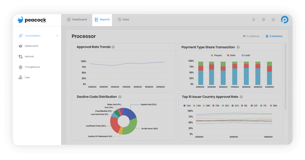
Here is a list of current available deep dive reports and what they can help you learn about your payments performance. Simply click on the report name in the left hand panel to view
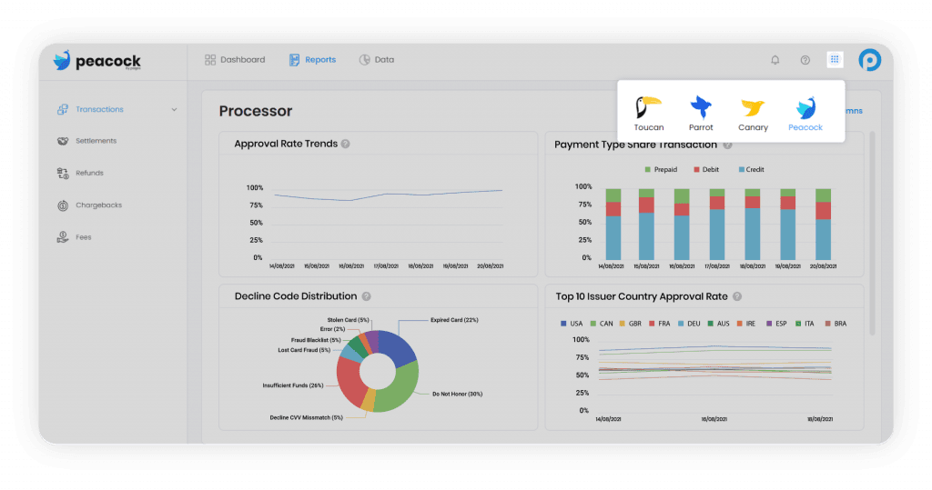
Chart Definition Tooltips
Need help with chart terms and definitions? Never fear - we all start somewhere. Simply hover over the question mark icon at the top right of each chart for more information.
Updating the Chart Size to Your Preference
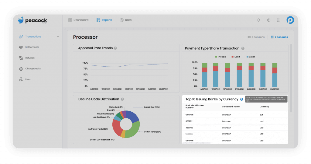
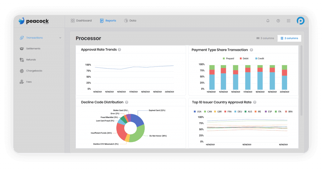
Peacock by Pagos has two configurations for chart size. At the top right hand corner of the dashboards and reports, choose between two or three columns of charts to match your preference.
As Always, Stay Tuned!
Whether this is your first time ever looking at payments data or you’re a payments industry veteran of 20 years, there is always more to learn and explore in our industry. Your payments ecosystem will always be facing change, whether it’s code releases from your internal teams or your partners’ teams, new regulations in certain markets, or innovative new payments methods. Pagos continues to push the envelope in payments optimization tools. Our current suite is just the beginning - stay tuned for more product launches, feature releases, and informational guides to our products.
We love hearing about optimization challenges; they help us understand what solutions are most valuable. Contact us and share your story!
If you haven’t yet registered for our No-Code Beta or custom API integration, sign up today!
By now, you’ve seen the power of Peacock by Pagos. You understand how the application supports payment data aggregation, visualization, and performance investigation. Now, let’s spend some time learning how to navigate the application in order to harness its full potential.
Starting from the Top: Why High-Level Summaries Are Helpful
When you log into Peacock, you first land on the Dashboard. In the default configuration, you will find six metrics that Pagos knows to be the most critical information when it comes to a company’s payments “pulse check”. See below for more information about these metrics and why they matter.
Turnover is the total successful sales transactions, minus refunds and chargebacks that settled on the same day. This is a point-in-time measurement of how much your net revenue is changing each day.
Average Order Value (AOV) is the average dollar amount your customers spend each time they place an order. AOV is a good proxy for how much revenue you can expect from each additional transaction.
Approval Rate Trends by Processor is the number of authorized transactions as a percentage of attempted transactions, separated by processor. High approval rate means more converted sales and fewer abandoned carts.
Transactions are the amount of all sales over time. Trends in your transaction volume help you understand your products’ seasonality, the traction of recent marketing campaigns, and overall customer engagement.
Chargebacks are the total dispute count for all processors by card network. This is a good lagging indicator for either (1) friendly fraud, or (2) issues with your product or customer operations.
Settled Volume by Processor is the total disbursed volume by day and by processor. This not only indicates what portion of your business is transacting through each payment processor, but also how quickly that volume is being disbursed by each processor when compared to turnover.
One of the key values of the Peacock Dashboard is the data normalization across all processors you use , which can be used for a fast, but detailed view of your entire payments operations. We know that aggregating data across all processors can be challenging and time consuming. Each one provides a different data format, using slightly different metric names and formats, sent to you via different delivery mechanisms. Even when using just one processor, Peacock aggregates and displays all the information your processor provides - even if it’s sent in multiple files. Peacock does the time-consuming and challenging data cleansing and normalization for you. That way, you can spend your time on payments performance awareness and action straight away.
In the Weeds: The Power of Peacock Reports
Across the top of the Peacock interface, you can navigate from the Dashboards page to the Reports page. Immediately, a list of reports populates on a panel to the left.
Here is a list of current available deep dive reports and what they can help you learn about your payments performance. Simply click on the report name in the left hand panel to view
Chart Definition Tooltips
Need help with chart terms and definitions? Never fear - we all start somewhere. Simply hover over the question mark icon at the top right of each chart for more information.
Updating the Chart Size to Your Preference
Peacock by Pagos has two configurations for chart size. At the top right hand corner of the dashboards and reports, choose between two or three columns of charts to match your preference.
As Always, Stay Tuned!
Whether this is your first time ever looking at payments data or you’re a payments industry veteran of 20 years, there is always more to learn and explore in our industry. Your payments ecosystem will always be facing change, whether it’s code releases from your internal teams or your partners’ teams, new regulations in certain markets, or innovative new payments methods. Pagos continues to push the envelope in payments optimization tools. Our current suite is just the beginning - stay tuned for more product launches, feature releases, and informational guides to our products.
We love hearing about optimization challenges; they help us understand what solutions are most valuable. Contact us and share your story!
If you haven’t yet registered for our No-Code Beta or custom API integration, sign up today!
Share this Blog Post
Share this Blog Post
Latest Blog Posts
Get the Full Picture: Analyze All Your Chargeback and Dispute Data in Pagos Insights
Get the Full Picture: Analyze All Your Chargeback and Dispute Data in Pagos Insights
Get the Full Picture: Analyze All Your Chargeback and Dispute Data in Pagos Insights
Payments Intelligence Requires Intelligent Payments Tools
Payments Intelligence Requires Intelligent Payments Tools
Payments Intelligence Requires Intelligent Payments Tools
Catching Spikes Before They Burn You: Monitoring BINs to Stay Ahead of Carding Attacks
Catching Spikes Before They Burn You: Monitoring BINs to Stay Ahead of Carding Attacks
Catching Spikes Before They Burn You: Monitoring BINs to Stay Ahead of Carding Attacks
Subscribe to our Blog
Subscribe to
our Blog
Subscribe to our Blog
By submitting, you are providing your consent for future communication in accordance with the Pagos Privacy Policy.